
The task in which we were asked to carry out involved us having to produce ancillary texts that connected to our main product, in the same brand identity. This was in order for us to be able to create the effect of a real advertising campaign for our up and coming thriller film. All the texts are connected to fully show the link between our film, magazine, and poster in many ways. This would allow consumers to distinguish our film brand from others.
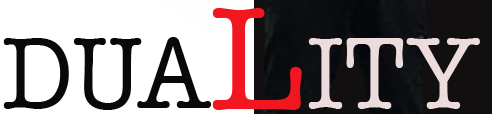
We named our film Duality, which connotes two things or something the has two sides. It symbolises the villain of our film having a dual personality. Our character is seen as a normal member of society and as a seemingly good person however on the contrary has a dark and sinister side. We show this in our trailer by showing that there is a villain as well as normal people within the film who appear as good. In order to portray this within our ancillary texts I have presented the female characters fear in my poster as well as focusing on the acting of the female character in her interview with a well known magazine. This would be what is expected of a film advertisement campaign. All three of the texts are linked as the use of font of the word "duality" is continued through all of my three texts. The film name comes on screen at the end of the trailer which is in the same font and colour as my magazine and poster. The choice of my colours of the text show the contrast of black and white. This theme connotes our film title being about a contrasting dual nature. Our film title is ultimately our logo, people would recognise the textured on all three and this created the brand for our film. Our brand image is what reflects our reputation as an enterprise and the opinion of our film, this would determine wether or not we feel we would succeed in a sequel of our trailer. The fact our brand is recognised across all three texts will promote the film more and create more people to pass on the message about our film from the original opinion leader.
In both of my ancillary texts the main image is of our main character Becki, this further suggests to the audience that she is our main protagonist. In our trailers narrative she appears the most on screen in almost every shot, she is seen as the most important character in the shots. My ancillary texts then follow this showing that she is the most important character and the audience should be left wanting to watch the film to know what happens to her. As a result this may cause the audience to identify with her, this follows the issues and gratification theory of personal identity, if consumers can identify with the character they are more likely to want to watch the film. This exemplfies the connection of the three texts our message flows through all three and they correspond with each other providing one ultimate message to the consumer.
In addition my three texts portray the genre of my film well. This helps the consumer to identify the products. I spent time researching my genre and the types of posters that they produce and the conventions of thriller posters, magazines and trailers. I found that the common things in posters were dark colours and colours that connote danger such as red. I also noticed that dark simple pictures were used, this got across the message that this was a film that consisted of danger and darkness. In addition the conventions of the magazine where to portray the main character and they're experience of playing their role in the film. Trailer conventions were fast paced, darkly lighted and often had music that built drama and enigma within the audience. The isolated location we used in our trailer was present in my ancillary texts, my poster depicts the main images of the trailer, a woodland a truck and a young girl, this follows the conventional themes of a thriller genre it used the conventional dark colours and low key lighting as well as the image being of my main character. This shows how all of my products linked through they're genre if I had used different colours on my poster that portrayed happiness my trailer and poster wouldn't have linked.
Through the use of genre conventions of aspects of mise-en-scene I feel my ancillary texts link to my main product well, this will make for a more effective distribution of our film. My film and magazine synergise in order to create the desired effect, the two industries link as conventions are similar the darkness in my trailer is represented through the actor in the magazine. The use of this means that the impact of my campaign is far stronger than if they were used individually. The consumers can see a link between all three of the texts and therefore recognise the film and the brand behind it. For example successful film brands is the James Bond franchise and the Saw trilogy, their marketing campaigns have allowed them to build an effective brand that allows them to make more and more films as part of their brand. Therefore combing all three texts will make my film more effective at distribution.
